9/09/2004
Fonts. It comes down to fonts.
Earlier, I posted about some recent documents that were released by CBS news concerning Bush's TANG service. The big crapstorm throughout the blogosphere, freeperworld and drudgeworld since about lunchtime has involved whether those memos are forgeries.
It comes down to fonts, people.
Specifically, the Bushbloggers claim that:
1. It's unlikely if not impossible that Killian used a typewriter that used proportional spacing of letters. (Compare courier with times new roman to see the difference between fixed and proportional spacing.)
2. It's downright impossible that he could have typed a superscript "th"; and
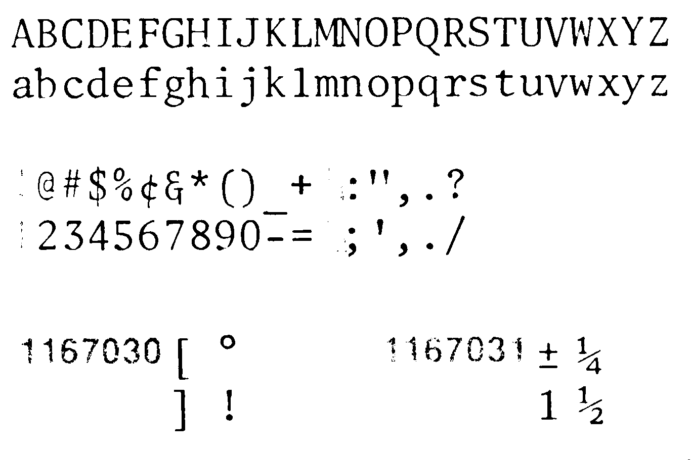
3. No fonts back then would make a number 4 with a closed top and no foot.
Can you believe this crap? The wingers don't like the content, so they attack the authenticity.
Anyway:
1. The IBM Selectric was released in 1961, and the Selectric II was released in 1972. The Selectric II not only offered proportional spacing, but used "golfballs" so that different fonts and font sizes could be used on the same document.
2. The Selectric II offered superscript typing.
3. Here's at least one selectric golfball font that used the number four with a closed top and no foot.
Also: I haven't confirmed it, but some people remember golfballs that had small "th" on them as part of the font.
Subscribe to:
Post Comments (Atom)


No comments:
Post a Comment